Monday 30 January 2017

COMPOSITION & FRAMING!! (not so easy stuff)

Prompts: Forest, Pilot, Bag full of random things

Thoughts

  • I would honestly say that these past sessions were the most relatable towards my practice. Creating good and effective composition is actually a lot harder than I originally had thought. Now I have been more conscious on how I would lay out my work.
  • It still took me some time to plan out which composition would help communicate the message and tone of the image. I personally thought that it was quite difficult and there were several times where I would not like one design and throw it away. 
1
2


3
4


  • I quite like this attempt in framing and working with three random prompts. Initially I wasn't sure if this counted, since it wasn't a literal butterfly and an elephant. Though personally I didn't like how it would seem strange to put a person, a butterfly and an elephant together. I suppose I flipped the brief since we were just told to draw an elephant, a butterfly and a person in general.
  • I originally thought of keeping the elephant's face blank, though Matt suggested to put eyes on them. And somehow the whole image changes. Even the slightest difference in the position of the eyes seem to change it. I suppose the eyes (contrasts greatly against the black) draws immediate attention.

Saturday 21 January 2017

End of Module Student Evaluation

BA(hons) Illustration
Module Code: Visual Skills OUIL405 Visual Narratives

Name: Diandra Wardhana
Student ID: dw262485

Please identify where the evidence for each of the learning outcomes is within your submission and how well you feel you have met the learning outcomes. Please also grade yourself in relation to the learning outcomes using terms:
> poor, satisfactory, good, very good, excellent (Note- This is so that the team have an understanding of how well you feel you have done. It is not an indication of the actual grade you may receive)

Learning Outcome
Evidenced where?
Blog, Sketchbook, Roughs Final Illustrations, development sheets etc.  (No more than 75 words)
Your grade
Using words:
> poor, satisfactory, good, very good, excellent
4A6 
Demonstrate a range of approaches to research in the collection, development and communication of source material.


Blog, Sketchbooks
Good
4B5
Explore individual responses to creative opportunities, source material and visual research appropriate to set briefs and identified problems.


Blog, Sketchbooks
Good
4C6
Select and investigate appropriate practical approaches to the investigation of visual development and communication of source material in response to a brief.


Blog, Sketchbooks, Roughs/Test pieces
Good
4C7
Explore appropriate processes and techniques in the visual development of ideas relating to narrative, sequence and content.


Blog, Sketchbooks, Prototypes, Final Illustrations
Good
4D5
Demonstrate an effective use of appropriate methods of recording, documenting and evaluating individual progress.


Blog, Sketchbooks
Good

Evaluation (See guidance below for more information)
You are required to write a 500 word evaluation of this module.

I was pleased that I had completed this module. It ended with a sense of accomplishment and that the research and development seemed worthwhile. I would say that I am quite satisfied with the outcome, though I particularly thought that the research, development and process was rewarding as I got to explore a subject matter that I really enjoyed.

Reflecting back to my research, I had wished that I could have looked more into the subject. I have gathered sufficient information though I felt that I didn’t use the most out of my research. Perhaps I could have spent more time exploring sea life in more depth. However, I had invested most of my time and energy exploring materials 
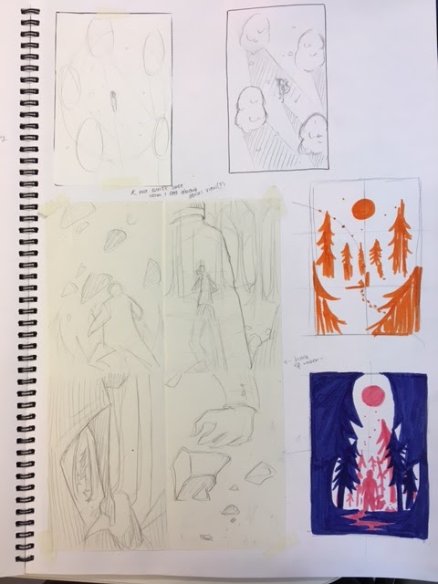
and approaches to visually narrate the intent of my project. Throughout the development week(s), I discovered that I was interested in shapes and colours, as well as paper cutting. I felt that it was rather surprising since I often use watercolours and I tend to focus lot in line quality. I thought that it was a rather refreshing change. I had looked into several creative practitioners and it was helpful in terms of kick starting my development and exploration. I was particularly inspired by Jon McNaught’s practice and I felt that his approach of using short, simple sequences and moments to capture a story was charming.

I honestly felt that I had difficulties focusing during this module. Perhaps it was because the amount of independence and I sometimes would get confused with what I am going with this brief. The issue was that I had been too fixated and spent too long contemplating on the problem more than I was finding solutions. For instance when it came to creating prototypes and mockups I felt quite lost. The ideas I had were everywhere and everything seemed disconnected. However, after speaking to other people it slightly cleared out my confusion. Though it was when I took the time to pause and evaluate my work to see where I am lacking or needing to further develop. From there, I actually scrapped my initial ideas, referred back to my research and decided to focus on a particular aspect that I would like to further explore. That phase of not being able to jump the hurdle was horrible and mentally draining.

Moreover I thought that I could have equally split my time and energy with creating my final piece. I felt that I had spent most of my time trying to figure out the intent of my project. I honestly thought that creating a visual response to something was rather challenging. Perhaps it was in terms of what I would communicate and how I would effectively communicate the concept so that the audience could understand it. This was something that I need to work on and get used to. Although my general view on this module involved a mixture of fulfillment and a lot of questioning myself.


TELL AN UNTOLD STORY PT 2 - Completed!

Front cover
Back cover


"What Lies Beneath" - title I decided to go with

Thoughts
  • I am quite satisfied with outcome of the picture book and how the panels turned out. I am also glad that I went with threading the book together since I tried stapling them with another copy (it was messy). Another concern is that I didn't exactly place the title of the book on the front cover, though instead its on the first page since the phrase was meant to continue through the back page.
  • Though there are just minor details that I thought I could have altered and developed. For instance, the pages with the words 'fleeting' and 'fading'. Initially placed it there since I wanted those particular terms to specifically describe the intent of the book (that and those words would be in people's minds).
  • Thinking back to it again, I honestly think that it might not really be necessary as I thought that the image itself could speak for itself. It's either that or I should have planned it better in terms of placing the text.

Additional notes
  • I feel as if I had just finished a marathon. It's an exaggeration though I personally am not good with long term projects due to several reasons: 1. I easily lose interest with the subject 2. the duration itself  
  • In terms of this project, lack of interest wasn't an issue. I really enjoyed the subject and brief. Also got to try and discover new skills and approaches to image making.
  • Due to it being a semi-long project, I really need to spread my workload. Though I also feel that the amount of 'free reign' somehow tripped me along the way. I may have needed to plan more thoroughly and evaluate my work as it progresses.

Friday 20 January 2017

TELL AN UNTOLD STORY PT 2 - Photoshop seem to dislike me.

(Well it's more of me not being a huge fan of Photoshop.)


Adding slight coloured outlines and detail.


I found it quite frustrating at how I can't really control the
brush strokes... (even though I used a tablet)

  • Personally speaking I quite prefer working with analog because it feels more organic and hand-crafted (?) I am quite disappointed at how the image has lost its texture and it seemed quite flat. I keep thinking that it's either the digital media or my lack of skill in using it. I think it's the latter. 
  • Although, it's not as if I would refuse to work digitally for the rest of my life -no. But I quite enjoy combining both analog and digital methods. As I am quite satisfied with the outcome of the coloured coral reef.
  •  I also found it convenient to change the saturation and contrast as well as working with coloured line work. I might actually explore and try out digitally painting in Photoshop (and hope to become a pro at it)

Thursday 19 January 2017

TELL AN UNTOLD STORY PT 2 - more development (and a lot of screenshots)


I went back to the clips I had of the fishes. I took screenshots of Nemos. 

Just to help me visualise the movement.

  • I had to go through the videos and photographs I took during the research/fieldtrip to Hull to study the movement and subtle, yet striking moments. It was those moments where you could miss it even when you blink and it was only by pausing per frame of the video to capture that fleeting feeling. (I nearly ran out of patience)

Cover page. Title or no title?

  • I thought of keeping the cut-out concept for the front cover page. I wanted to keep the feeling of 'looking into an aquarium' and the idea of fragility of nature (?) I just need to think of how I would print it out and not rip it the moment I cut it out.
Too crowded?
Too empty?


  • After the OUIL404 seminars I may have become fussy and sensitive (a lack of a better term) towards composition. I quite like how I could shift around the cut-outs and see which composition works. Though for this particular page, somehow it seems to lack something. Perhaps it's because of the white space around it?

Making more roughs for the small panels.


  • It was quite difficult to capture the details with gouache. I may actually digitally paint the details for most of the pages (if necessary). Though other than that, I think I am quite happy with where this picture book is going!

Wednesday 18 January 2017

TELL AN UNTOLD STORY PT 2 - Why did I not come across them before? (another inspirations post)


Birchfield Close - Jon Mcnaught

  • I really like the sense of quietness in his work. Despite the rather mundane story behind his short comics, somehow it's charming. The very slow movements and sequences is perhaps what makes it interesting (to me.)
Understanding Comics - Scott McCloud 
(it's a very interesting comic book about comics)
  • I briefly read through this book, hoping to understand more about comics since now I plan on creating short comic strips. 
  • I didn't exactly use much from this book as it mainly introduces what comics are and so on (not too relevant with what I am doing since I am not exactly creating a full story with dialogues etc). It was insightful and I learned new things about comics and what it really is! Other than that, though I suppose it was helpful in terms of getting to know how the panels and sequences are used (such as the section below)

Chapter 3 - Blood in the gutter


Grand Budapest Hotel, a Wes Anderson film

  • I would say that this was one of my favourite films in terms of cinematography. Though I hadn't thought of it in a way that this film seem to capture simple sequences or moments. It is also somewhat fragmented, though more towards still moments. 
  • I thought that it was something I might look into when creating my picture book. Though I think that I should be selective of the moments that I would like to capture per frame of the panels.

Monday 16 January 2017

TELL AN UNTOLD STORY PT 2 - Step back a little. Breathe!

We just had a crit today and I showed my work with confidence in where I was going with it (after all the moments of doubts and contemplation). Though I honestly felt more lost and confused than ever, after the session. 

Thoughts
  • I generally received positive feedbacks about my ideas. I would continue developing with the panels/boxes as it seemed an effective way of demonstrating my idea with clarity.
  • The gold motif was effective as it seem to connect the book as a whole (it flows), though a concern is whether it would appear as prominent when it gets printed out?
  • I was also told to consider words or text (in which I haven't touched upon...)

Concerns
  • I thought that I knew where I was going with it, though as I reflected back to my work, I may have a lot of ideas, exploration and development: but it was all over the place. I can't seem to find a focused concept.
  • I also might have overcomplicated my idea. As the message I wanted to convey was rather complicated and not concise -one is about dying corals, then climate change, etc. (I was confused on where this is going...)

I thought that I would focus on the aquarium and similar
brief beautiful moments of nature (?)
  • I had briefly spoke and talked about my concept to Jamie. I realised that my intended message wasn't effectively communicated through the work I had done so far. Also the conversation somehow shifted how I thought and how I could approach it. 
  • Meaning: I scratched my initial ideas and decided to visually communicate a different concept. I honestly thought that my initial approach to the subject matter was rather literal and generic. It made me think: what can I do about this?

What I should do?
  • From the conversation I had, I was able to sum up the gist of what I intended to convey through this picture book. Instead of going through a general approach of the destruction of corals/sea life. I would focus on the idea of 'fleeting beauty' or 'moments
  • I was advised to focus and be more selective towards what I would like to convey (in which I personally think that I am not too good at. Being selective.
  • I also thought that I could deconstruct my initial ideas, make it simpler as it would give more clarity in my work. Perhaps I could look back to my research of the trip I made to The Deep. I would need to find out what is it about marine life that is 'fleeting'. 


I finally got my head around my problem. Jamie helped sketch out his
approach in laying out the story.
My rather rough storyboard

Additional notes

  • Look at Jon Mcnaught's works (Jamie recommended. Hence I trust his advice.) He also mentioned one of my favourite directors, Wes Anderson. I find his films aesthetically pleasing and somehow the stillness in every scene seem to capture everything, the mood, atmosphere and story. 
  • To sum up, I personally think that I may be more perceptive towards where I am lacking and what I could improve on (in terms of work). It's somewhat satisfying to say, stop, this does not make sense. I need to fix it, but how? 
  • I suppose, all I need to do is reflect and evaluate, backtrack for a while after the rush of development and exploration (in which I may have been lost in simply creating drawings and not think things through properly)

Saturday 14 January 2017

TELL AN UNTOLD STORY PT 2 - :( 

Just as the heading says, I am not too satisfied by the outcome of the exploration this past week. Although I think that I would like to focus on the idea of the threatened sea-life.

My attempt in working digitally
  • I did try working with Photoshop, was I amazing at it? No. Though I quite like how I was able to tweak with the composition, saturation and that I could digitally illustrate certain elements (in more detail) such as the human silhouettes.
  • I never considered that it would work well. I might actually incorporate digitally illustrating details for the other spreads, since paper-cutting or painting wouldn't capture the details as prominently.

Swatches
  • I have tried initially creating swatches before moving into the mock-up pages for the book. I thought that it was quite helpful to let my initial ideas drawn out and approach the subject matter in a different way. 
  • I quite like the non-representational approach as it makes the audience try to read into these imagery. Though I honestly don't know how i would get this to work? Connect?


  • I quite like this page, though I honestly think that it doesn't flow along with the whole concept of the underwater life. I might need to re-think this one through. 


Panels! Short comics (?)

  • I honestly enjoy creating small panels of stories or scenes. I suppose I may have grown attached to this idea, as it seem to be recurring throughout the designs I sketched up. Somehow the idea of capturing small moments and produce a narrative as a whole is what interests me about comic strips.
  • Though I personally think that I shouldn't over-complicate the content.


Tuesday 10 January 2017

TELL AN UNTOLD STORY PT.2 - What to do next? 


I quite like this approach of comparison. Looking back at it again, it made me think that this has more sense of narrative than simply creating patterns or shapes (such as below)


Though perhaps if it were to put alongside something else, it would make more sense/connection (an ambiguous approach on one page and a more representational illustration on the next?)

I was trying to illustrate the cause of bleaching corals through a diagram.
Looked more like a geographical map (e.g. layers of the earth).
Not as coherent as I thought it would be. Perhaps I should try
a different approach.

I was trying out a different type of paper (translucent) in hopes
to be able to see through the different layers of the shapes and patterns.
I had thought of the idea of 'unveiling'. Though it didn't seem to work well
(the layers beneath aren't visible)


I wanted to try out small panels/comic shorts to help visually communicate the message or intent. I quite like the structure and difference in comparison to a full page of one imagery. Whereas this could fit several images or content, even a 'story'. I feel that it is also an effective way for the audience to grasp the meaning behind these imagery.

Things to consider/try out

  • Try creating swatches or samples of certain elements (coral patterns perhaps?) and not create something purely for its visual aesthetics. 
  • Play around with different media or image making methods. I would maybe try paper cutting and collaging (since I have been mainly using watercolours and gouache).
  • Motifs (?) something I could look into -it could somehow tie in the content and create this sense of flow and fluidity.
  • Perhaps try an ambiguous approach instead of representational, or maybe make a comparison? Or look at things through a macro level (broader?) and diagrams of how the destruction of corals came to be (I was thinking if not diagrams, panels/comic shorts in a page)