Sunday 30 October 2016

ILLUMINATION WEEK 2 - The final outcomes


Final illustrations

Thoughts
  • I actually have mixed feelings about the final outcome. However, I generally like the colours as it seem to link all three illustrations together despite the completely different content. 
  • I ended up using ink and gouache. I thought that I made the right decision since it gave bolder and more solid colours as well as it defines the shapes
  • The overall outcome is simpler than I thought, which I didn't mind since it articulates the idea better (despite it being rather obscure). My initial roughs were quite overcomplicated and somehow muddles the whole visual concept with unnecessary details. 
  • Perhaps for the window illustration, I may have kept the scenery simpler as I feel that a lot is going on in that particular area


Friday 28 October 2016

ILLUMINATION WEEK 2 - Finally a breakthrough. Developing ideas.


Rough designs

Thoughts

  • I finally decided the colour palette. I personally think that the article itself is quite heavy and perhaps slightly grim, I thought that brighter colours would balance out the text. 
  • Composition wise, I still wasn't fixed on the final design. Though for that particular design, I wanted a gestural drawing to portray the idea of surrendering or releasing. 
  • I also think that I would make the final piece slightly simpler in terms of the line and colouring so it wouldn't be too distracting.

Inspiration


1 Million Dance Studio, South Korea
Coreographed by Lia Kim & Boyoung Park

  • I actually had to take a breather. I was watching a dance studio on Youtube and looked at dancers (contemporary dancers in particular). 
  • They were very expressive and that was when I had a lightbulb moment -aha! Watching their choreography and movement somehow gave a sense of giving something away, which made me think about the idea of releasing 'empathy' (?)


More rough designs

Additional thoughts

  • I was going through the colour palettes for the other designs in particular since I thought that getting the colours right was pretty essential. I wanted colours that contrasts greatly and somehow illuminate the subject. Though, I can't seem to find the right combinations. 
  •  I am still torn between whether I should have various windows or just one. Since I thought that if I had used the first idea (with many windows) it might be distracting (?) and not focus on the image as a whole. 
  • I tried out different types of markers and Copic markers in particular wasn't working well. Somehow the colours weren't showing. However, using ink for block colours was more efficient but a bit grainy (perhaps too watered down?)

Plans

  • Finalise designs as well as media. What I have in mind at the moment is ink. 
  • In terms of colour palette, I would like to make it similar (within one spectrum), perhaps with slight alterations since I'd like to have a connection between the three illustrations

Wednesday 26 October 2016

ILLUMINATION WEEK 2 - Help. 


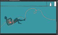
I honestly wasn't sure where I was actually going with these roughs. I tried sketching out the roughs digitally, since it would be efficient to look at different colour schemes. So I did and I wasn't too satisfied about it. 


Rough colouring and design 

 Trying out different colour palettes


Thoughts

  • You could say that it was a rather unsuccessful experimentation. I didn't quite like the digital outcome, since I thought that digitally illustrating them would be an option. Now it isn't. I quite like to show a bit of subtle texture of the paper and it looks rather two dimensional and flat. Perhaps, I could make that effect with photoshop but somehow it wouldn't give the same organic effect if it were done with ink and paper. 
  • I wasn't too happy with the composition either. I feel that it's quite lacking. It may be less overcomplicated and easy on the eyes. Though, I think that I'm not getting the message across very well. 
  • Though I think that I've got the layout pretty much covered. It's just an issue of how I'd use the given size so my illustrations wouldn't be too big and concentrated or too small with wasted space around it. (e.g. the floating figure in the colour tests)

Plan (what to do next)

  • Re-design and think through what I actually want to communicate. Think of what I'd like to implement or take out to help convey the concept. Basically fix the content and composition. 
  • Explore different colour palettes and media. Perhaps try warmer colours (striking and uplifting feeling) and experiment with ink, markers, watercolours. 

Tuesday 25 October 2016

ILLUMINATION WEEK 2 - IDEAS


Chosen roughs for the final pieces


Rough sketches

Thoughts

  • I started off with several designs, a few I didn't quite feel was 'right' or suits the article (either I overcomplicated the design or that it the imagery I chose didn't effectively communicate the concept). Basically, I was rather stuck. 
  • Though, fortunately I got to talk to Jaime about the roughs and somewhat helped me sort out which might be interesting to develop further. A constructive feedback I thought was very insightful was to not be afraid of ambiguity and a 'poetic' approach would be interesting. 
  • A few concepts I had in mind involved the idea of 'safety of our homes', looking outward into the world and giving away empathy. I'm still quite unsure on how to further develop this. Perhaps I'd look into more simplistic and metaphorical approaches 


Plan (Note to self)

  • Concept/image
  • Composition
  • Think of colour scheme/palette
  • Size and layout (square, portrait or landscape)


Sunday 23 October 2016

PHOTOSHOP WORKSHOP!


I had quite an enjoyable time tweaking around and exploring Photoshop.

Original illustration
5th edit

 I think this work is the one I am most satisfied with. I was surprised on how much the tone and mood could change with slight colour change/composition. There is something about a clear, simple aesthetic that gives an understated, elegant tone. Also I wouldn't want to completely alter the original illustration. 


4th edit

I was talking to a friend who said that this looked like something from an album cover. Now that I think about it, it reminds me of those indie album covers that has low saturated, simplistic shapes and obscure photographs. 
3rd edit

I was actually inspired by the blue and red of anaglyph 3D photographs. So I wanted to try it out with the drawing and it turned out quite interesting. Comparing it to the original ink illustration, this composition creates a completely different character as it gives a more graphic vibe


2nd edit

1st edit


To wrap it off, I enjoyed tweaking around Photoshop. For future reference, I may want to make subtle edits (without butchering the original), perhaps colouring in sketches or add slight line work digitally. I would try and appreciate Photoshop to an extent. I wouldn't want to completely alter the original piece and lose that essence of analog work

Tuesday 18 October 2016

LINE QUALITY - LETS DRAW SOME LINES!


20 lines, zig-zags, squares and circles


Thoughts

  • The introduction to drawing and line quality in illustrations was quite insightful. It was mentioned that being able to draw 'well' takes about 10,000 hours. It's not a surprise that to get better in drawing is to draw a lot. Just like the phrase 'practice makes perfect'. Though I think that the essential part is the process of exploring and discovering our mistakes and working around them.


My attempt at drawing with various lines 


  • From this exercise I thought that I may have been too focused on crafting (which Matt also pointed out). I wished I had tried to do something out of my comfort zone and see where it would take me. 
  • Perhaps it was also because I was rather fixated on getting the drawing look 'right'. Perhaps I could have been a bit more curious and explored different approaches.
  • Also looking at other people's sketchbooks, I quite like the ones that tried out different media or tweaking/altering one subject, perhaps the colour, shapes or composition. Though, I thought that it was a nice experience to actually see other people's journeys and thought process clearly just from their sketchbooks.


Monday 17 October 2016

ILLUMINATION WEEK 1 - EXCITED? MAYBE. 


We were just introduced to our second brief: editorial illustration! Excited? Perhaps, to a certain extent. The article I was given revolves around the society and empathy, with a little bit of human psychology. 

To start off the project, we had a little game of articulating a word with drawings. I happened to get the word 'break'. So the first thing that I could think of was literally 'broken things' then it altered to summer breaks, heart breaks, coffee breaks etc. 


Thoughts

  • I may have made drawings that were scenes and literal images of the word. I could have tried to go for symbols. This task reminded me of a lecture we had regarding visual memory and semiotics. I suppose some people tend to grasp visuals quickly especially towards universal signs and symbols.  
  • The article I was assigned to was rather information heavy, but it was an interesting topic (which I am excited about).
  • My only concern is visually interpreting the content of the article. I may have only been thinking of literal images in my mind, which perhaps may have cornered me into a wall. Though I think that I should make roughs, be it bad ideas or spectacular ones. 
  • Another concern that I am worried about is what if the illustration I made wouldn't make sense? Then again, I'll have to explore and plan first before actually thinking of the outcome. I'll get back to this later. 

TYPOLOGY POSTER WEEK 2 - Thoughts & Feedback


Feedback

  • I could see that people quite like the colour scheme and how it's striking, which I agree with. I think that the time I used testing out colours were worth it. Also I received comments regarding the concept and use of cutting the paper out. 
  • During the group critique, I came across a particular typology poster that I thought was very well-crafted. She had 'how to hide' as her prompt. 
  • What I enjoyed from her work is the simplicity and engages with the audience as she had little characters hidden in different places inside a house. I also thought that the composition was very clever, as she placed the typology of places to hide in one subject (the house).
Final Poster

Thoughts & what I've learned?

  • I am quite satisfied with the outcome. However, there are a few things that I thought could have been better. I think that I could have either used different media or light shade of navy blue since the electronic devices aren't too visible. It's lost within the brightness of the background. 
  • The icons are drawn a bit too small, thus some logos or symbols aren't really coherent. 
  • Though I think that this concept communicates the idea of 'disappearing' more effectively, even though it isn't literal. The whole plug and switch idea is rather essential as it ties the whole concept of getting off the internet/social media by deleting your account or forever switching off any electronic device. 
  • What I've generally learned is that I could have tried different approaches and experiment with more media until I exhaust all possible ideas. 

Sunday 16 October 2016

TYPOLOGY POSTER WEEK 2 - Final 


Rough layout

Plan 
  • I plan on keeping the whole poster simple and minimalistic to suit the concept of technology. 
  • It would either be in different shades of blue or black 
  • Going back to the idea of 'linking', I thought that it would be interesting to link these different electronic devices with cables and it all leads to one power source, with a switch on it. 

Problems 
  • I wasn't too satisfied with the look of fine liner and ink. It's more of an issue on how I draw these images. No matter how many times I draw these phones it wouldn't look clean and precise
  • Through the on/off switch, I intend to convey the idea of energy coming out from these devices flowing and it could be switch off. Somehow with the monochromatic scheme, I am having difficulties in communicating that idea.  


Material + colour testing

Solution

  • I tried out paper cutting as it gives a more upright and angular look
  • It wasn't intentional at first when I thought of using contrasting colours for the background and the foreground. When I had cut out the screens, I set it on a different coloured paper and I like how it seems to illuminate the subject.

Other Concerns

  • I wasn't sure if this would still be considered a monochromatic poster. 
  • I used gouache and somehow the images weren't really visible. I was really fixated on keeping it monochromatic and the colours I chose for the electronic devices were too similar to the coloured paper. It's difficult to see when I held the poster up. 

Don't really fancy the blue. Not really striking. 
Colours to subtle? Contrast?
Inspiration (I found a light at the end of the tunnel!)


Korean BBQ by Coen Pohl
호떡 (Korean Pancakes) by Coen Pohl
  • Coen Pohl's illustrations aren't exactly monochromatic but I was actually inspired by his work, particularly because of the simplicity and choice of colour. It's very minimal, using one specific colour and contrast it with a darker shade. It's an interesting way to highlight the subject and illustrate light/shadow. 

Friday 14 October 2016

TYPOLOGY WEEK 2 - Roughs & Testing

Collage
Cultural masks (?)


  • Referring to my previous concern of using collages as masks, I tried it out, which I thought that the process was very enjoyable as I get to try out different images and I could try out various compositions
  • Another idea that I thought of was cultural masks from around the world. It was something that just came into mind. 
Problems
  • I am not too satisfied with the outcome of the roughs. I quite like the cultural mask approach. It's appealing and would be effective as a typology of masks, however I feel that it doesn't visually communicate the concept of 'disappearing'. 
  • Another concern regarding collages is that, it's rather chunky. The more I look at it, the more I wasn't quite keen on this idea. My main setback is similar to the cultural mask idea. 

Solution 

  • I looked back at my other ideas and I thought that perhaps I could work around the 'disappearing from the internet' concept. The only concern with this concept is how I would communicate the idea of disappearing and the format (typology). 
  • Though an idea I had in mind was using icons or symbols of (24) different social networks or media such as Facebook, Twitter etc. on various electronic devices, which may have solve the typology issue. 


Ideas 
Rough layout with ink and fine liner
Material testing with different coloured paper/tools

Thoughts 

  • I had been using mainly watercolours and ink, though I didn't like the fact that it bleeds. Also it appears very subtle on coloured paper. 
  • I felt that acrylic would be thick and glossy. Then I tried gouache and I like the matte texture. It stands out against coloured paper. 

Wednesday 12 October 2016

TYPOLOGY WEEK 2 - The most indecisive moment of my life


This week I started to refine and develop my ideas first before actually working on the final piece. There were things that I wasn't too satisfied about and still conflicted on which ideas to put forward.

Development

1

I wanted to use the disguise concept and draw 24 different types of masks. What I had in mind was that I would have 1 'real' face amongst a crowd of disguises.

2

3

Taking back my previous words of not using the idea of 'disappearing from the internet', a last minute idea came up. During the group critic, a comment stood out to me, which says 'to link' my concepts since I had various ideas and possibilities. 

Exploring Materials & Concepts


Thoughts
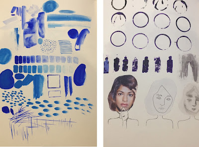
  • I wanted to go for different hues of blue for my poster. But I am still not too fixated on that and I would need to test it out whether it would suit the whole concept. 
  • I explored more on the stamping process, though this time I used acrylic since ink tends to bleed a lot. It came out a lot thicker and gave more solid results
  • Out of curiosity, I wanted to try and implement collaging. I had just used person's face from the magazine and stuck it on. I think that it does a good job in creating an illusion of wearing a 'fake' face. Though I wasn't sure how it would look if it were monochromatic and have a page filled with 24 collaged faces. 

Trying out a light box


  • I thought that hand drawing the same figure 24 times would be inefficient and it definitely wouldn't produce identical images. I tried out tracing over a rough sketch of hands, which I sampled from my 'erase' concept. The light box was really handy since I could draw the same image over and over.