ILLUMINATION WEEK 2 - Help.
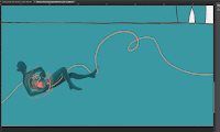
I honestly wasn't sure where I was actually going with these roughs. I tried sketching out the roughs digitally, since it would be efficient to look at different colour schemes. So I did and I wasn't too satisfied about it.
 |
| Rough colouring and design |
Trying out different colour palettes
Thoughts
- You could say that it was a rather unsuccessful experimentation. I didn't quite like the digital outcome, since I thought that digitally illustrating them would be an option. Now it isn't. I quite like to show a bit of subtle texture of the paper and it looks rather two dimensional and flat. Perhaps, I could make that effect with photoshop but somehow it wouldn't give the same organic effect if it were done with ink and paper.
- I wasn't too happy with the composition either. I feel that it's quite lacking. It may be less overcomplicated and easy on the eyes. Though, I think that I'm not getting the message across very well.
- Though I think that I've got the layout pretty much covered. It's just an issue of how I'd use the given size so my illustrations wouldn't be too big and concentrated or too small with wasted space around it. (e.g. the floating figure in the colour tests)
Plan (what to do next)
- Re-design and think through what I actually want to communicate. Think of what I'd like to implement or take out to help convey the concept. Basically fix the content and composition.
- Explore different colour palettes and media. Perhaps try warmer colours (striking and uplifting feeling) and experiment with ink, markers, watercolours.


No comments:
Post a Comment