Monday 27 February 2017

ACTS OF KINDNESS - Background Research Continued... 


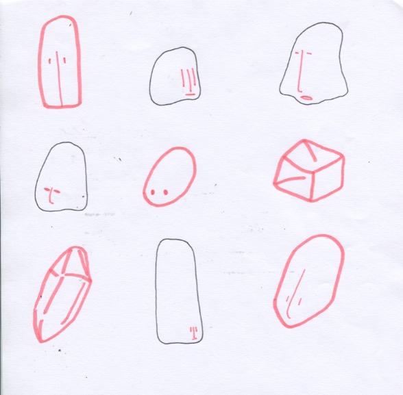
I wasn't sure what this was. I just made simple
shapes
enjoy their smile 


familial love

  • These were initial ideas from different concepts. I thought that the concept behind these stickers were quite generic. The content wasn't as interesting as I hoped it would be and I lost interest in them. 
  • Knowing that we would only be working with Illustrator, I have been fixated in created simple and shape-based illustrations. I honestly think that this particular requirement is hard in terms of having to communicate certain ideas through simple, clear images.

Further research
"What defines success?" 

- is it wealth? happiness?
- are there priceless things?

"Get Rich, Be Happy" - humanity's problems can be solved by the attainment of universal material prosperity (modern society's ideology)

"...consumption is considered more important than creative activity." - Joseph Pearce. 

- consumer psychology (consumerist and capitalist culture
- humans are social beings, we have a need to belong (conformity

"What motivates people to change their attitudes?" 

Solutions!

- motivation
- raise self-confidence/believe in yourself 
- try not to be too indulged in society/trends and other people's reactions/opinions 


Thoughts

  • I feel that I would be personally invested in this particular concept as it was something I could relate to (feeling slight pressure from being surrounded by modern society/ideology and the digital culture). I would now focus on thinking of short phrases or words that I would like to communicate to help emphasise the imagery.
  • I roughly grasped the gist of what I would like to convey within my sticker. However, my current concern is how I would communicate these ideas in a simple, visual design. I might need to consider common imagery or symbols in which the general public would understand.


Sunday 26 February 2017

ACTS OF KINDNESS - Background Research


"What defines success?"

"What is satisfaction? What is self-appraisal?"

IDEAS 

'Pay It Forward' concept

Expressing empathy/sympathy to loved ones

Societal pressure

How can I help - be the first to reach out

Give compliments 

Be kind to yourself first

Sharing is caring

Be a listener 

Express yourself!

Positivity! 


  • From these ideas, I thought of the issue of social pressure in which I personally think that it is quite a big issue within the youth and adults in general. I also thought that it was something that might be interesting to look into and further explore
  • I thought that it might be too personal (?) or is a sensitive subject to discuss. However I felt that, I see social pressure everywhere, on media, with celebrities and even the people around me. It was something that I thought I couldn't ignore and wanted the world to know. 
  • I was briefly looking into the idea of social pressure and how it came to be. I would say that the digital world, modern society and success came hand in hand with social pressure. I need to look more into the HOWs and WHYs

Wednesday 22 February 2017

Adobe Illustrator Workshop!


Tonari no Totoro - My Neighbour Totoro
(Illustrator practice)


Thoughts

  • My worries about working with Illustrator for the new brief reduced (yay!) as I pretty much got the gist of using it. I initially had misconceptions and felt strongly about not liking Illustrator as it only allows vectors -I take my words back.
  • It took me a while to get my head around the software, though generally I feel much more comfortable working with it. I am not as anxious as I had been when we were told that we could only use Illustrator to create the sticker.
  • In terms of creating concise and minimal aesthetics, Illustrator does a good job of it. In a sense it has benefits in terms of creating symmetrical, simple and graphic design-like illustrations. I might not use this software often, however for future reference, Illustrator is where I would go if I wanted to work with colours, shapes and precision. 

SCREEN PRINTING! - Final prints done!!


loving the marble-like pattern
final prints


Last experimental print. We mixed
the colours. 

Thoughts

  • I am really surprised with the outcome of the print as I did not expect the layered effect. Since I had designed it mainly in black and white, I didn't think about the overlapping shapes. 
  • I particularly enjoyed the subtlety of the patterns and the darker shade (from the overlapping). The colours work well with highlighting the layering effect. It's quite striking, though the brightness emphasises the print as a whole. 
  • In terms of the printing experience, I would do more printing. I really enjoyed the experimental process of it and the lack of control on how the final print would look like. There is this addicting feeling of wanting to keep on printing since it was so efficient and quick to make prints.

ACTS OF KINDNESS - introduction to very, very simple image-making

  • Currently I am feeling both excitement and worry. I am excited in terms of designing simple and minimal illustrations, as I like working with colours and shapes. Though my worry is visually communicating the idea. I need to consider a lot about the imagery, something that people would universally understand.
prompt: playing table tennis
Very simple and minimal. I like. 


  • I am really looking forward to this next brief! I quite like how loose and broad this brief is in terms of visualising the idea of 'kindness', which the concept in itself is very open to interpretation
  • I suppose there are a few concerns that I have in mind at the moment. One of it being the limitation to only using Adobe Illustrator (in which I still quite unfamiliar with). The other involves how I would communicate this 'act of kindness' through design. 
  • Though I am really excited in terms of being able to explore and visually communicating ideas through shapes and simplicity.

Monday 20 February 2017

ACTS OF KINDNESS - Art Deco!

VOGUE magazine cover (The Condé Nast Publications Ltd.)
Print
December 25, 1929
Guillermo Bolin
  • Personally I figured that I quite enjoyed working with colours and shapes. I suppose I quite like the idea of clarity in expressing my work and perhaps slight vagueness/abstract concepts.
  • I thought that Art Deco (1925-1940) was an interesting starting point. One of my favourite practitioner, Malika Favre, seem to be greatly influenced by the Art Deco style. I feel that with Art Deco, since it revolves around architecture, decorative and graphic arts, there is this sense of modernity, simplicity and functionality
  • Clearly then Adobe Illustrator did not exist, though through prints, they could still create work that focuses on concise, clear shapes. Particularly in Art Deco, I noticed that their posters explores symmetry, geometrical shapes, streamlined composition, simple and both striking and easy for the eyes to read (e.g. travel adverts, magazine covers)

Australian Surf Club (1936)
Lithograph
Gert Sellheim
Source: National Gallery of Australia
  • I had to mention out two particular posters, since I thought that they were very effective as visuals. The first being a fashion magazine cover and the other is an advertisement. However, what I thought was interesting is the lack of detail and imagery, yet it clearly speaks to the audience
  • I would say that colours play an essential role of grasping the audiences' attention, as well as setting the tone/mood (Australian Surf Club has a really summery vibe)
  • Looking at the Vogue cover, I thought that the simplicity of it is more than enough. That particular gesture of the hand often shows how women like to admire their accessories or nails (a rather feminine concept). Though it suits the whole fashion magazine concept of 'advertising' their products.

I SEE FACES - Final GIFs!


Thoughts
  • I ended up going for an earthy and positive tone
  • I felt that I could have made a more consistent series of GIFs. The first gif slightly strayed away from the whole theme. Though it still maintained the energetic and positive tone. 
  • However, I quite like the playful and experimental aspect of this brief. It is interesting to see the different effects and outcomes of creating something flat and three dimensional.
  • After seeing my peers' gifs, there were a few things in which I thought was a clever way of tackling this brief. I like how you could use the exact same shapes and character, but tweak slight movements or change the composition (crop the image or zooming out). There were some gifs that are visually vague/conceptual, which is often really engaging

Sunday 19 February 2017

I SEE FACES - 3D GIFs!


Bloom


added more movement on Photoshop

  • Honestly it was quite difficult manually changing and taking pictures of each movement. The only issue I was was that the main still-object gets moved slightly each time I add something. It's not seen as separate images, however when I combined it, I could see the shifting movement
  • I thought that lighting was an issue, it kept changing with every picture I took. It doesn't drastically change the character and the GIF, however, it isn't exactly pleasing to look (not uniformed/distracting).
  • Though I feel that this GIF has more intent to it. I had thought of something inanimate (such as a rock) could sprout plants and bloom, which is peculiar and purely based on imaginations. Though this burst of oddity/strangeness is what I grasped from the  mood of the song


  • It looks a lot better pieced together as a GIF and looped in comparison to seeing it as separate photographs. I was actually worried that the frames wouldn't fit together as I took these in a stop-motion method (there might be slight movements in the character's position). However I had a make-shift tripod for my phone and it helped stabilise it.
A more 'trippy' gif

  • I thought of reusing the previous GIF and changed the composition/movement slightly. I was thinking of making a moving pattern as I thought that if it were just the character, it seemed quite dull and there wasn't much 'content' to it.
  • While I was creating this GIF I thought of the 'oohs' and 'aah' sounds from Don Cherry's song (and partially inspired by Yuichi Yokoyama). I would have inserted some sound as it would help emphasise the context.

playing around with some photos 
and turned it into a gif
  • This wasn't intended, though my sister took a picture of me drinking from the can (I didn't empty out the can when I was making my character). I thought it was interesting and painted each frame on photoshop to look as if I was drinking some concoction. 

Saturday 18 February 2017

I SEE FACES - Totem pole or rock? (development)


Camera burst
  • I tried out the 'burst' on my phone and it was helpful to some degree. It helps with taking multiple frames as it moves. Though it doesn't really work with my gif in particular since the movement couldn't be taken in one shot. It was more effective to move it manually and individually photographing them (even though it's time consuming and some inaccuracies can occur)
I wanted to go for the earthy/world-like atmosphere


  • In terms of its character I tweaked it slightly in terms of its design (it's still meant to be a rock). Though I felt that the playfulness and energetic atmosphere wasn't vividly conveyed through the character well. However, it's quite earthy/world-like in terms of the material used and the patterns. 
  • I might need to consider the background colour and whether I want to add smaller characters or subjects.

YUICHI YOKOYAMA
My sister actually referred me to this Japanese artist. She had said that my characters looks like his work, bizarre looking. (Thank you?)

New Engineering - Yuichi Yokoyama

sound word (fallen paper): 'bira bira bira'
sound word (door open?): 'paka'
sound word (moving mechanic object): 'gacha'

  • I honestly thought this was a really interesting Japanese comic. Thinking about it again, I could see a resemblance with my character design. There is this similarity in simplicity, monotonous expression and vibrant colours (and just strange-looking characters)
  • Though what caught my attention in particular was that the comic didn't have any dialogue. However it focuses on the movement/action and it is sound based. It was something I planned on incorporating in my gif (even though there won't be any sound attached to it)

Thursday 16 February 2017

I SEE FACES - More GIFs

too long? crowded?

0.1 sec

0.2 sec (I quite the calming, lazy movement). The
green adds a calming tone to contrast the earthy/solid
red and browns
  • It surprises me how the timing changes things. I had to do several tests for the timing, since sometimes it could either be too fast that I couldn't catch on the movement or that it's too slow and the movement becomes chunky.
  • Though generally, I would go for a faster time and loop it. But I noticed that brief moment of movement that would make me keep watching it over and over until my brain processes the gif.

Test 2
  • I edited this on photoshop (just added a background colour) and the colours really bring out the characters.
  • Though I am not too sure about the colours changing in the background?? Sure it is striking, but it might be too distracting and divides the attention from the main subject.

Test 3

Wednesday 15 February 2017

I SEE FACES - Patience...was the key! (development)


Update on the flip book - it works better with slightly thicker paper (the printing paper was too thin apparently). Though I am not too satisfied with the outcome of using a flip book. I feel that it's quite hard to control the timing and that I can't seem to get the character accurately per layer. (that and I may be doing it wrongly)

(I thank whoever invented the light box!)

1st test with lightbox :0
  • I did a test with a light box and it turned out a lot smoother than I expected, since I was able to trace over the previous frame and tweak the next.

More tracing
  • I did a few designs (not fixed yet) though I feel that it's quite empty and repetitive? As well as it doesn't really convey the earthy/trippy/playful atmosphere.
  • I might need to think of a more energetic or perhaps wavy movements (?)

Patiencewas the key to GIFs


  • I felt that this particular one was quite stiff? I also shouldn't have changed the background colour since it was distracting and there is less focus on the movement of the mouth.
  • That and I thought that the gif just didn't make sense -meaning: I didn't really but much thought into the intention.


Paper cut?

moving the pieces by hand was such a pain

Thoughts
  • using a light box is much more effective and get a much smoother movement as I could trace over the still figures
  • Moving the pieces isn't as smooth (might be chunky). Though I get more control over the movement of the gif. But I thought that adding block of colours emphasises the character. Also there is this aesthetic of paper-cut/collaging (?) 
  • Personally I think that the shadow and the layers between different coloured paper is what makes the whole composition interesting, there is this slight illusion of depth. 

Tuesday 14 February 2017

I SEE FACES - It's getting there...!


Living rocks. I was partially inspired by this
conspiracy theory I read saying 
that rocks are jelly-like 
but if we touch them they become solid!

Pattern/detail or no?

It feels different now with the fast-paced text behind
  • The fast movement at the back gives an illusion that the shadow is moving much more smoothly? Perhaps now the attention towards the movement are everywhere that it may lose focus on the subject itself
  • That and I got a hang of timing, photoshop effects and layering (this gif literally have about 60 layers)
  • When making this particular GIF, I had the 'oohs' and 'aahs' from Don Cherry's song stuck in my mind. Though I felt that those particular parts accurately depicts my characters -being rather playful and quirky. I might actually base most of my GIFs on sounds.
yay or nay at the grainy effect? Too much?

Monday 13 February 2017

I SEE FACES - Sketchbook work/planning


Initial plan
I quite like the solid colours, but the
expression seems repetitive
The fluid/vibrant patterns work well. Wasn't
sure if I would include faces or not. Do I really
need them?


less is more (?) Don't overcomplicate
the expression

Thoughts

  • I reviewed my initial character designs and I may have overlooked one of it, in which I thought could evolve further. I thought of incorporating the same rock character with a simple face, but I would perhaps explore with much more vibrant and energetic colours and patterns
  • I might still need to think about the patterns. With the movement and all would it be too crowded? Need to consider where I am going with my intention: playful/energetic or earthy/contemporary.  
  • Thinking back to African colours and Southeast Asian statues, I might actually want to further explore that area since it gives off a similar tone as to what I have in mind.