Tuesday, 28 March 2017


End of Module Student Evaluation


Learning Outcome
Evidenced where?
Blog, Sketchbook, Roughs Final Illustrations, development sheets etc.  (No more than 75 words)
Your grade
Using words:
> poor, satisfactory, good, very good, excellent
4A7
Demonstrate an understanding of the relationship between visual language, visual communication and problem solving in the development of appropriate solutions to defined problems.
Sketchbook, roughs, development sheets
Good
4B6
Demonstrate a critical awareness of individual intentions in the production and contextualisation of work related to appropriate creative practices in illustration.
Sketchbook, blog
Good
4C8
Identify, evaluate and select appropriate practical and conceptual approaches to the development of visual solutions to set problems.
Sketchbook, roughs, blog
Good
4C9
Demonstrate the ability to incorporate visual skills and sensitivity to appropriate media in the development of a body of individually identified responses to set briefs.
Sketchbook, final illustrations
Good
4D6
Effectively manage time and resources in order to document, present and evaluate a self-determined body of work in response to set briefs.
Blog
Good


This particular module taught me beyond just creating images or illustrations. I would say that effectively visually communicating a concept or a message was the ultimate challenge. There was so much thought, planning and process involved for each set briefs. I suppose solving a design problem is something that I learnt and it is a skill that I hope to further develop on.

I personally think that I had invested most of my time and attention in this module in comparison to the previous ones. Perhaps it was due to my interest towards the briefs and actually being able to show my own practice through my work. I would say that I was most satisfied with the Persons of Note brief, from the process to the final outcome. I thought that the experiments and test pieces helped a lot in terms of trying to communicate my intentions through visual means. Usually it took me a while to get my head around briefs, though it made more sense when I actually started doing practical work. I was glad to have spent time and energy developing as I get to find out both successes and faults with ideas or methods, working my way from those trial and errors. 

Throughout the module, there often cases where I change my mind or certain designs after speaking with peers or coming across new things from research. Though I would say that research was an effective way of working, not only through online sources or books but also from doing field research. For instance, with the Persons of Note, I spent some time outside creating sound maps. I realised that there is a difference between doing secondary research and actually observing as well as experiencing something first hand. Personally I feel that by observing things, I subconsciously try to make sense of it and reflect upon how it could help with my practice; there is just more thought put into it. But also, I found feedbacks really helpful and even simple conversations with friends. Usually the comments and things stated made me look at my own work at a different angle and ways in which I never thought of. I suppose it is that constant self-reflection and questioning that helped me develop my work.

Contextual research had been helpful throughout the module. Generally, I look at elements such as use of colour, composition and how they express tone, mood as well as communicating through imagery. For instance with the Act of Kindess brief, I was generally inspired by an exhibition I visited, which talked about social and cultural issues. Though despite the various ways of communicating that subject matter, these practitioners had used universal symbols and imageries. I thought that it was clever and effective as they used elements recognisable to the audience. As I have come to realise that I like to work with shapes and colours, I had been thinking a lot about how I could communicate messages effectively through visual means.

I am generally satisfied with the things I had done and learnt from this module. Even though I explored different approaches, I feel that I am still working within my comfort zone. For the last brief, I tried going bigger, work looser and less constricted to focusing on details. It wasn’t something I am used to, but surprisingly I enjoyed the space to simply explore. I thought that it was useful trying things out first and then extract certain elements or method of working to further develop them into final pieces.


Persons of note - Final designs


  • I think that this project and the previous ones had been very graphic design-like, with lots of shapes and solid colours. Though looking back at it, I would like to try to work with different ways of making images (media-wise). I feel that I have been working with the basic paper collage lately.
  •  But I really like the organic/handcrafted feeling, though perhaps combining digital media with analog work would actually look nice? Then again, it would also depend on the aesthetic I am going for. 
  • I would say that I am most satisfied with this brief, in terms of the research, process and the thought put into it. I honestly wouldn't change much about the final outcome. Though I feel that I could have tried mono print or digital media (it is also possible approach). I feel that this project reflected my interests and practice the most.

Monday, 27 March 2017

Persons of note - feedback + trying things out


  • Looking back at the things people said about my work, I was seeing words such as 'noise', 'zing', 'tactile', 'interactive', harmonious', 'strum of an off key guitar the summer heat' (very specific), 'bouncy'. I was glad that the idea of sounds and movement communicated successfully!
  • I am quite surprised at the 'time & love in craft' note. I did think a lot about the crafting, though I feel that I could have put a tiny bit more time and attention into some parts. Such as creating the pattern/textures of the paper and the sewing (I am honestly mediocre in sewing)
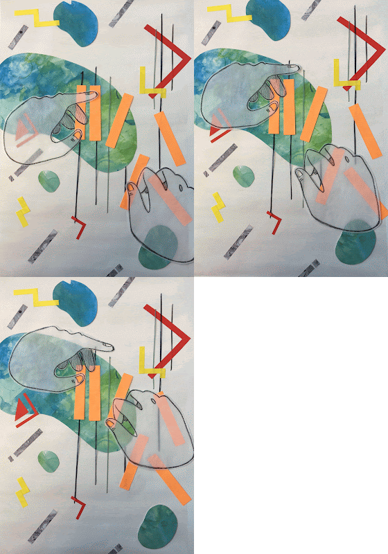
GIF 1. Just playing around with digitally drawn elements and
analog media.
#2. Wanted it to actually move. Looks cool! Putting my gif making
and Photoshop skills to use!
#3. Seeing it move makes it look more like a clapping hand
(with the quick/blinking, 1-2 beat)
  • Someone mentioned about trying to digitally refine them. I would, but that would eliminate the organic/tactile aesthetic of it all. Either way, I played around with my designs on photoshop. I was curious.

Sunday, 26 March 2017

Persons of note - semi-final designs


Poster: testing composition. Looks like 
it's actually playing the piano
  • I was quite glad that I didn't immediately stuck down the pieces as I kept changing the composition. It was quite tricky as I had to consider the subject being centred or not, whether it is crowding or better spread out (?)
Initial postcard designs
  • I really like gouache, though for this particular brief, I wasn't sure if it would suit the concept. Though I like the flat texture and matte finish. But I could still see the brush marks and didn't come out as solid as I wanted
  • Though I quite like the clarity of the shapes against a flat background (no patterns or anything). I'll maintain the shape-driven/simple aesthetic. Though I'll test out different materials.
Postcard design 1 (did some embroidery)
  • I actually prefer the more graphic aesthetics and solid shapes. I feel that it suits the concept more (?) But to begin with, illustrating 'sound' is already difficult as it is. Though I think that using basic, universal shapes is an effective approach as they are recognisable
  • I also quite like how the embroidery turns out. It adds an organic feel to the whole image, juxtaposing the rigid, geometrical shapes.

Friday, 24 March 2017

Persons of note - Development + testing


Hand modelling (trying to make a 'snapping'
gesture)

Trying out embroidery (not so neat)
  • I might actually incorporate embroidery as a motif for my final designs. I feel that aside from having a different texture, but also an element to link the separate imageries. As well as to symbolise 'strings' of a piano/instrument (as I wanted to focus on Cage's love for sounds and his distinct practice: the prepared piano)


More postcard designs.

Stamp tests
more tiny tests


  • I was torn between keeping the stamps minimal and having it patterned. Though if I were to keep it minimalistic, it might be too conceptual? And if I were to add more symbols, especially different ones, it would be too confusing.
  • I might actually have the same patterns and sound-based shapes for the stamps. Even though it might be repetitive, it would make more sense and connect as a whole series.

Postcard designs. Wasn't sure if I
should have this or the stamps patterned?
  • Though there would be more space for the postcards and that I could put more detail into the postcards in comparison to the stamps (they are tiny!)
Composition time!

1
2


3
  • It's quite crowded at the moment and I haven't added the embroidery. Though I think I would take out some elements. I hope that the symbols/shapes would still make sense to audience. (hint: rain, fast, sharp sounds)