Persons of note - semi-final designs
 |
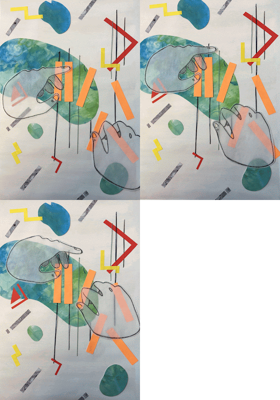
| Poster: testing composition. Looks like it's actually playing the piano |
- I was quite glad that I didn't immediately stuck down the pieces as I kept changing the composition. It was quite tricky as I had to consider the subject being centred or not, whether it is crowding or better spread out (?)
 |
| Initial postcard designs |
- I really like gouache, though for this particular brief, I wasn't sure if it would suit the concept. Though I like the flat texture and matte finish. But I could still see the brush marks and didn't come out as solid as I wanted.
- Though I quite like the clarity of the shapes against a flat background (no patterns or anything). I'll maintain the shape-driven/simple aesthetic. Though I'll test out different materials.
 |
| Postcard design 1 (did some embroidery) |
- I actually prefer the more graphic aesthetics and solid shapes. I feel that it suits the concept more (?) But to begin with, illustrating 'sound' is already difficult as it is. Though I think that using basic, universal shapes is an effective approach as they are recognisable.
- I also quite like how the embroidery turns out. It adds an organic feel to the whole image, juxtaposing the rigid, geometrical shapes.

No comments:
Post a Comment